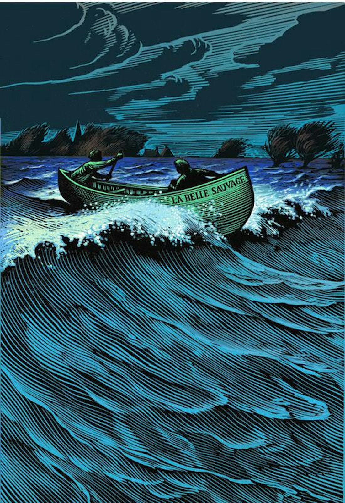
Alien tripods and Donald Trump: Behind the scenes of Sophy Hollington’s 48-hour linocut illustration for The New Yorker
At a time when countless digital programmes have been developed to emulate age-old techniques, London-based illustrator, artist and printmaker Sophy Hollington stays true to the original. Known for her exquisite linocuts – a process that harks back to the early 20th century – Sophy’s work is an intricate interplay between minute mark-making and bold design. When asked to contribute to The New Yorker’s Page Turner online, she once again turned to her trusty lino tools – this time to bring a Tango-coloured, spaceship-riding Donald Trump to life. Working with a time-consuming medium under a tight deadline; this is where Sophy’s skills shine. She recounts the process of taking an idea from a sketch, through the lengthy linocut process and finally to a pixel-perfect image for the screen.
Project Background
I received an email from Kara Haupt, an art director at The New Yorker, out of the blue, and the whole thing was completed just two days later. In this instance I didn’t ask how the art director found out about my work (even though this is always a good thing to do), but I imagine they must have seen my work in The New York Times Book Review, which had featured a piece of mine the week before I was contacted. That piece had a similar literary, dystopian theme.
Kara suggested portraying Donald Trump in the illustration, as the article discusses the way in which young adults’ science fiction is being used to explain our current predicament. She also suggested that the classic image of The Tripod Trilogy be depicted, as it’s such an important visual cue for the series of books that the writer of the article, David Cantwell, uses as the crux of the piece.

Research Insights
Creating an illustration can be a bit of a balancing act between trying to communicate the intent of an article, while providing a really enticing visual. For all editorial pieces I’ll generally receive the copy with the brief. I go through this and note down the key things that excite me, and think about how I can sum up the general feel of the article. Sometimes an illustration can include more obscure elements alongside over-arching ones, so it’s always worth highlighting anything that pops out at you. You also need to consider the materials you’ll be working with; some ideas will be more successful in one medium than in another.
Sometimes the best ideas are the most obvious, and come very quickly. I’ll often start by doing a few sketches, slowly weaving elements into compositions that could become the final, but there will often be a prominent idea that I want to take further. I generally like to email ideas over to art directors one at a time, and only offer alternatives if it’s needed. It’s important to me that my favourite ideas are generally the ones that get used.
“Sometimes the best ideas are the most obvious, and come very quickly.”
Editorial jobs are generally more open to experimentation and don’t always come with very specific instructions attached. However, you’re often working to a tight deadline, so you don’t have time to ruminate too much. The turnaround here was so quick that I didn’t have much opportunity to get stuck into serious research. Instead, I just did some basic picture searches online to get a good idea of how popular culture has portrayed these tripods. I remember seeing a 1970s book cover which had the tripods shining very stark beams of light, and their extended pincers reaching out for the teen protagonist. It seemed very clear to me that Trump needed to be portrayed in the driving seat, and that his Tango-coloured hand would make the perfect pincer.


Development and Production
Being on New York time is always a blessing as you can work well into the evening and still catch them at the end of their day, which is around midnight for us. As the turnaround was so fast, I had to push some other projects with longer deadlines back a bit. I also had a trip to Paris planned for two days after receiving the brief, so I had to work a lot quicker than initially proposed! I was quite lucky with this project, in that I could do this without having to work 16-hour days on two projects. I love the rush you get from being busy, but I would be lying if I said it wasn’t stressful.
“I have to let the client know that any changes are very tricky to implement as lino is such an uncompromising medium.”
Once my initial sketch was approved I started working on the linocut. I have to let the client know that any changes are very tricky to implement, as lino is such an uncompromising medium. It normally takes up to a day to carve the lino and then print the image. For this I tend to use a mechanical pencil and an A3 sketch pad, carbon paper for the transfer of sketch to lino, the lino itself, lino cutting tools (six different scoop shapes – I use pfeil), Caligo oil-based black ink, paper to print on, my nipping press, and a wooden spoon to burnish and make sure the print will be strong and even, just in case the press wasn’t delivering an even pressure.
As this was for an online publication, I also had to work to pixel dimensions at 75dpi and in RGB. It took another evening to then scan the image in add the colour using Photoshop. I adjusted the colour-way a few times to suit the art director’s preference, and then the final image was sent as a hi-resolution jpeg that same evening.
A perk of doing editorial illustrations is that generally you’re working with professionals who really know their craft and how to get the absolute best out of you. It can be a really rewarding dynamic, not entirely unlike that of tutor and student at university.


Delivery
The time constraints were tough, but I get a bit of a kick out of that – I think it helps to keep my brain on track. I hate sitting with something for too long, to the point where you stop being able to really see it. But I did start to lose sensation in my right index finger from carving so much! It didn’t come back to life for a couple of weeks, but I think I’ve managed to stave off carpal tunnel syndrome for now at least.
The art director gave me some positive feedback, but apart from that it went up with very little fanfare. I suppose that’s the nature of illustration. It’s not so much about you as the purpose the illustration serves, and I’m fine with that. I like the image and I feel like some of the small risks I took paid off. It’s informed other pieces of work since, and it’s also quite possibly got me other jobs that had similar, science fiction undertones.


Interview by Marianne Hanoun
Mention Sophy Hollington
Mention The New Yorker
Mention Kara Haupt


