How to nail a pitch deck

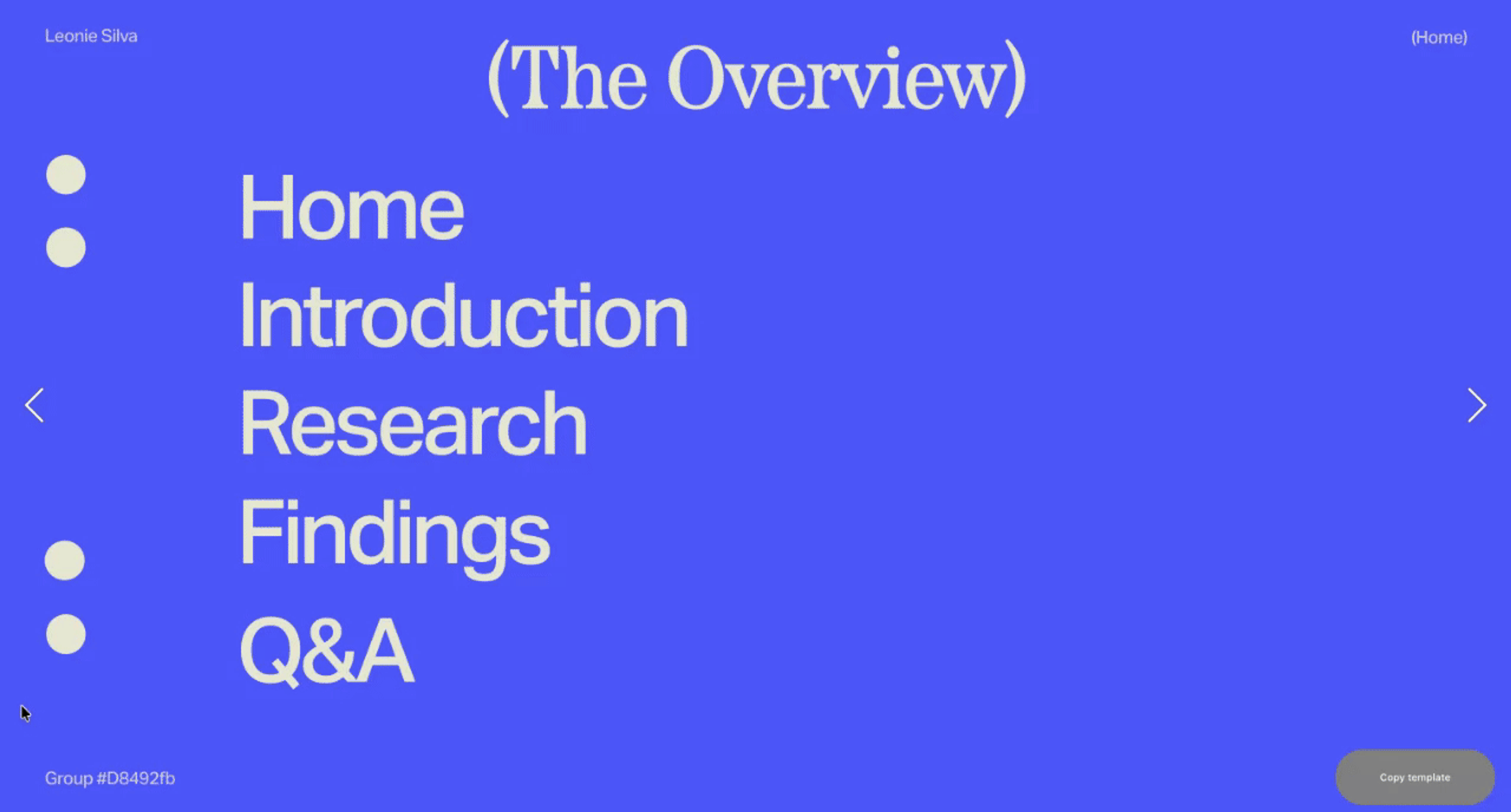
Chapters
You don’t need flashy animations or fifty slides to make a strong pitch. This guide looks at how to build a clear, effective pitch deck, focusing on structure, storytelling and design choices that help ideas land.
What is a deck, and why is it important?
A pitch deck is a set of visual slides that helps turn ideas, insights and data into something others can quickly understand. You might use one to show projects, explain what you’re proposing or share work in progress.
A deck might be presented live or online, shared by email or on social media, or even published as a site. Whatever the format, a good pitch deck stays short, clear, and compelling.
Designing a deck can sound complex, but the fundamentals are straightforward once you understand them. This guide breaks down how to approach a pitch deck step by step, from shaping your message to structuring and designing your slides, with examples you can adapt to your own work.
Ideation, structuring and writing
Define and map your message
Whatever the design, your message comes first. Figure out what you want to say from the start. Then, create an easy-to-follow structure of your message.
Every story has a beginning, middle, and end – your deck should, too. Structure your info so it flows naturally and logically. You can start by jotting down all your ideas in a text file. Highlight the must-know points and ditch the rest.
Also, try to plan the structure so that each slide has one main statement. People typically absorb one message at a time and tend to mark all the rest as secondary. Quick check: can you sum your slide up in one sentence without contradictions? If yes, you’ve nailed it.
Gather supporting data
Once your core message is set, support your points with examples, facts, or numbers your audience can grasp. Strong data makes abstract ideas concrete and gives your statements credibility. Use analogies, relatable examples, or real-world numbers. When showing them, sometimes zoom out to give the bigger picture.
Be sure to show how your idea solves real problems. Be specific here: instead of “we improved performance,” try “we reduced response time by 30%.”
Draft your text
While pitching, spoken words carry most of the message. Slides should support them with keywords, short phrases, or headings.
First, choose your tone of voice. To do so, you need some research on your audience. Try to figure out who they are and how they communicate. Formal pharma pitch? A university crit, internship presentation or freelance pitch will all call for slightly different tones – adjust your language to suit the context and audience. Stick to precise, professional language. Indie startup? You can be freer, more casual.
Then, come up with a strong opening. The first minute is your hook to set the mood, highlight the key points, and capture attention. There’s no universal hook for every situation. Still, you can begin your pitch by stating an unobvious fact related to your topic, making a joke – memes and GIFS are great here, or asking a question that makes your audience curious for the answer.
Once both the tone of voice and the opening are set, write, read, and cut. Less is more. Think keywords, bullet points, and short statements. Lean into images and infographics, since they carry meaning faster than words alone.
Design
A clear design and hierarchy are what make a pitch deck easy to follow. The design tricks below will help you communicate what you’ve got without losing attention:
Choose visuals that work for your audience
Do some research before preparing a pitch: figure out who your viewers are and what their visual language is. Then, tailor your visuals to their preferences. It won’t make or break your deck, but it’ll earn you extra points with the core audience.
Keep your style consistent
Your pitch is part of your brand, so keep it neat, clear, and easy to follow. Set the key elements yourself – logos, typefaces, colors, content types, infographics – or pull them from your company’s brand book. Use Readymag's Newold template here.
Avoid creating “slideuments”
Overloaded decks are painful to read. In the data world, these are called ‘slideuments’. Help your audience focus by highlighting numbers, dynamics, and results. Use infographics instead of dense spreadsheets, and link to detailed docs for those who need them.
Use visuals to do the heavy lifting
Visuals are powerful: we can digest a picture in half a second. Add illustrations, videos, photos, and icons to make points memorable, and use videos to bring processes to life.
Choose fonts wisely
Limit your typefaces to two or three, make sure your deck works for the back of the room as well as a laptop screen. If you’re confident with the type, you can experiment with custom fonts, as ‘businessy’ doesn’t mean strict. Don’t forget font styles: they save time while re-arranging things.
Go interactive
To keep viewers engaged, stick to vivid, interactive elements: videos, GIFs, animated text, galleries, or – if used carefully – music.
Use forms for feedback
If you’re sharing a deck digitally, think about how people can respond or follow up. A simple contact link or feedback prompt can help turn interest into a next step.
Design for the back seats
If presenting live, make sure the last rows can read everything. Big fonts, high-res images, and clear visuals act like road signs: they convey the message fast and without clutter.
Adapt for mobile
Not everyone will see your deck on a big screen or read it on a laptop. Optimise for mobile so viewers can see every part of the deck without zooming. Actually, Readymag automatically adapts projects to mobile with a single click, giving you a decent layout you can fine-tune.
Publishing
As soon as your deck is ready, take an unbiased look and do a few things before publishing:
Ask yourself:
- What should each page tell the audience?
- Do your visuals make the point clear?
- Are there elements you can remove without losing style, clarity, or a touch of fun?
Cut anything non-essential. Check headings, tone, word choice, and sentence flow. Headings should match visuals and work together as a system. And yes, proofread everything once again.
Make sure every video and animation works smoothly. If you plan to send the deck, also check that videos play inside the presentation, not in a separate browser window.
Add links and copyright
Treat your presentation like a mini publishing project. Use open-source content when possible and follow copyright laws. Include links to additional materials and websites, and even add analytics tags to see how the deck performs. Also, don’t forget to leave your contact information.
Prepare a deck to send and a deck to show
When presenting live, keep text minimal, since you’ll cover the details live. For solo decks, add more context to guide the reader through the visuals.
Think about ways to update
Publishing your deck on a platform that’s easy to update is a huge time-saver. Sometimes it’s just a typo, and sometimes, crucial data changes. Presentations in Readymag are perfect for both live sharing and sending. One link, one domain, and any tweak you make goes live instantly.
To see how others structured, designed, and animated their websites, landing pages, editorials, or portfolios – which are also a pitch of one’s skills – give Readymag’s examples a look. It’s a curated collection of designs that inspire, and you might find your portion of verve here.